Design Tokens: How to Bring Them Into a Product That Already Exists
Design tokens store design decisions under one name so design and code stay in sync. Here is how the token layers work, how tokens reach production, and how to add them to a product that already exists.
Quick Summary
- Design tokens give design decisions a name. A token pairs a value with a purpose, so designers, developers, and tools all reference the same decision.
- Three layers is the common structure. Primitive, semantic, and component tokens are the industry standard, though this may vary depending on the system, the brand, or team structure.
- A hex value becomes a primitive once it's named. Raw values scattered through a codebase are the starting point, and naming them is the first step toward a system.
- Tokens can move from Figma to production code. Code syntax on Figma variables and a semantic CSS layer let generated components read tokens instead of hardcoded values.
- Existing products can adopt tokens in stages. An inventory, a curated scale, a semantic layer, and clear consumption rules come before converting components.
- AI agents need more than tokens. A component map, per-component specs, and generation rules tell an agent how to use the system it's reading.
Every product runs on design decisions about color, spacing, and type. When those decisions live as raw values repeated across Figma and code, changing a brand color means finding and editing every copy, then checking for the ones that were missed.
People can work around that gap. A developer knows which blue is right, and a designer catches the wrong spacing in review. But an AI coding agent has no way to know either. It copies the values it finds, hardcoded ones included, and repeats them in every component it generates.
In zeroheight’s 2026 research on AI in design systems, 82% of teams said they use AI in some form, and 59% reported UI being built in ways that bypass the design system.
For the business, that shows up as review time, rework, and a product that drifts from its own brand as fast as AI produces code. Design tokens give those decisions one name and one source, so people and agents reference the same values.
This article is for teams with a product already in production. We’ll walk through a recent project where the Figma file arrived with only a color scale and a few font variables, raw hex values throughout, and spacing outside any scale, and show how our team built a token system from what was already there and set it up for AI agents to use. First, a closer look at what a design token is.
What Are Design Tokens?
A design token is a named value that stores a design decision, so designers, developers, and tools all reference the same thing.
Each token pairs a value with a purpose. Its name says what the value is for, and that's what separates a token from a plain variable holding a number or a color.
Tokens are usually stored in a platform-neutral format such as JSON, which lets the same decisions be converted for the web, native apps, and design tools.
The Layers of a Design Token System
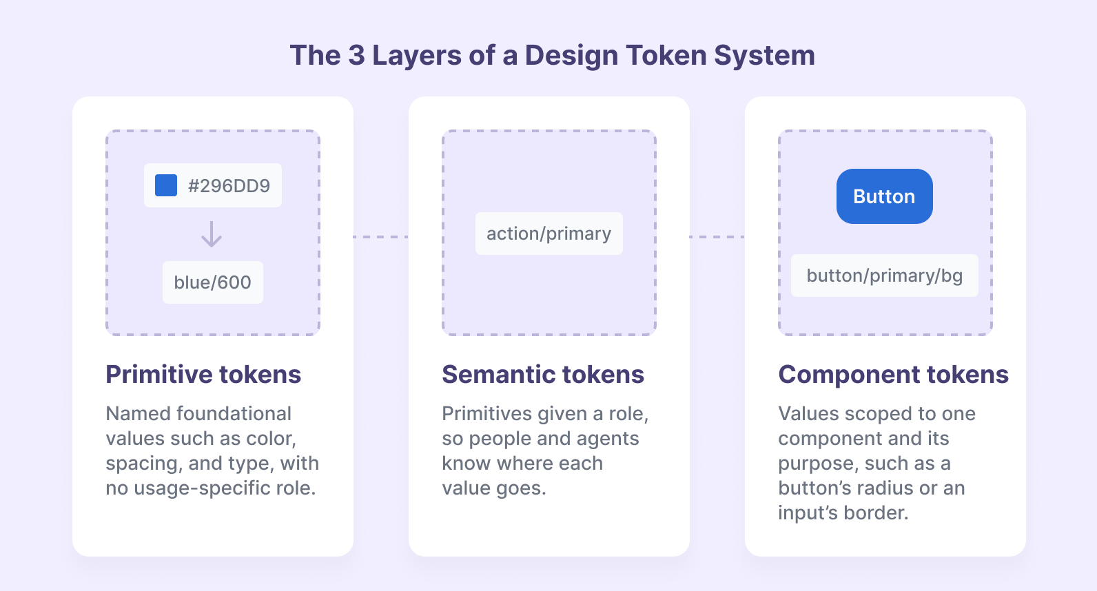
A three-tier structure is the industry standard, though it isn't mandatory. Smaller or single-brand systems often stop at the semantic layer to avoid extra overhead. Component tokens become necessary when a product scales across brands, supports AI workflows, or handles complex design edge cases.
Primitive Tokens
Primitive tokens are named foundational values: the palette, the spacing scale, and type sizes. They have no usage-specific role.
A hex value and a primitive token are often treated as the same thing. A hex value is a raw value. It becomes a primitive once it has a name in the system, such as neutral-900, that everything else can reference.
Semantic Tokens
Semantic tokens give primitives a role. In our own design system, neutral-100 became color-surface-light, and the same approach covered buttons, states, text, inputs, and decorative elements.
The semantic layer took the most work, because nothing semantic existed and we had to build it from zero. It's also the layer that pays off most. A name like color-surface-dark tells an agent where a value belongs, while a name like primary-700 only tells it what the value is.
Component Tokens
Component tokens are scoped to one component and its purpose, such as a button's radius or an input's border. A component token moves to the semantic layer when it represents a shared purpose, and that move is a deliberate design decision.
Theming Across Layers
The theme is set by an attribute in the HTML, so components stay theme-agnostic. Changing a token updates the whole UI without editing each component.
Here's how the layers connect, from a raw hex value to a component:
{"primitive": {"neutral-50": { "value": "#F9FAFB", "type": "color" },"neutral-900": { "value": "#111928", "type": "color" },"primary-200": { "value": "#BAB5D9", "type": "color" },"primary-800": { "value": "#373859", "type": "color" },"radius-md": { "value": "8px", "type": "dimension" }},"semantic": {"color-surface-default": {"light": "{primitive.neutral-50}","dark": "{primitive.neutral-900}"},"color-text-default": {"light": "{primitive.neutral-900}","dark": "{primitive.neutral-50}"},"color-action-primary": {"light": "{primitive.primary-800}","dark": "{primitive.primary-200}"},"color-text-on-action": {"light": "{primitive.neutral-50}","dark": "{primitive.neutral-900}"},"radius-control": "{primitive.radius-md}"},"component": {"button": {"radius": "{semantic.radius-control}","background": "{semantic.color-action-primary}","text": "{semantic.color-text-on-action}"}}}
Switching data-theme on the <html> element changes every semantic token at once. With data-theme="dark", the button’s background resolves to primary/200 and its text to neutral/900, while the radius stays at 8px. The button never needs to know which theme is active.
How Design Tokens Move From Design to Production
Figma is our source of truth. Design leads, metadata is extracted from the file, and React code is generated from it. Going from code back to design happens as an exception.
Each Figma variable carries a code syntax value, which gives every token a structured path that code can map cleanly. A CSS token layer then maps those values to semantic names with descriptions, and generated components read from that layer instead of using hardcoded values.
The chain only holds if the scale stays curated. Arbitrary values, such as one-off Tailwind spacing, break it: a global change to the spacing scale stops reaching every component.
In a headless stack, tokens and components can extend into the CMS as well. In one project, a skill mapped React props to Drupal fields through an endpoint, so an agent generated the page and its Drupal JSON together. Editors and developers ended up working from the same component definitions.
How to Add Design Tokens to an Existing Codebase
Adding tokens to a product that already exists is a migration done in stages, alongside product work.
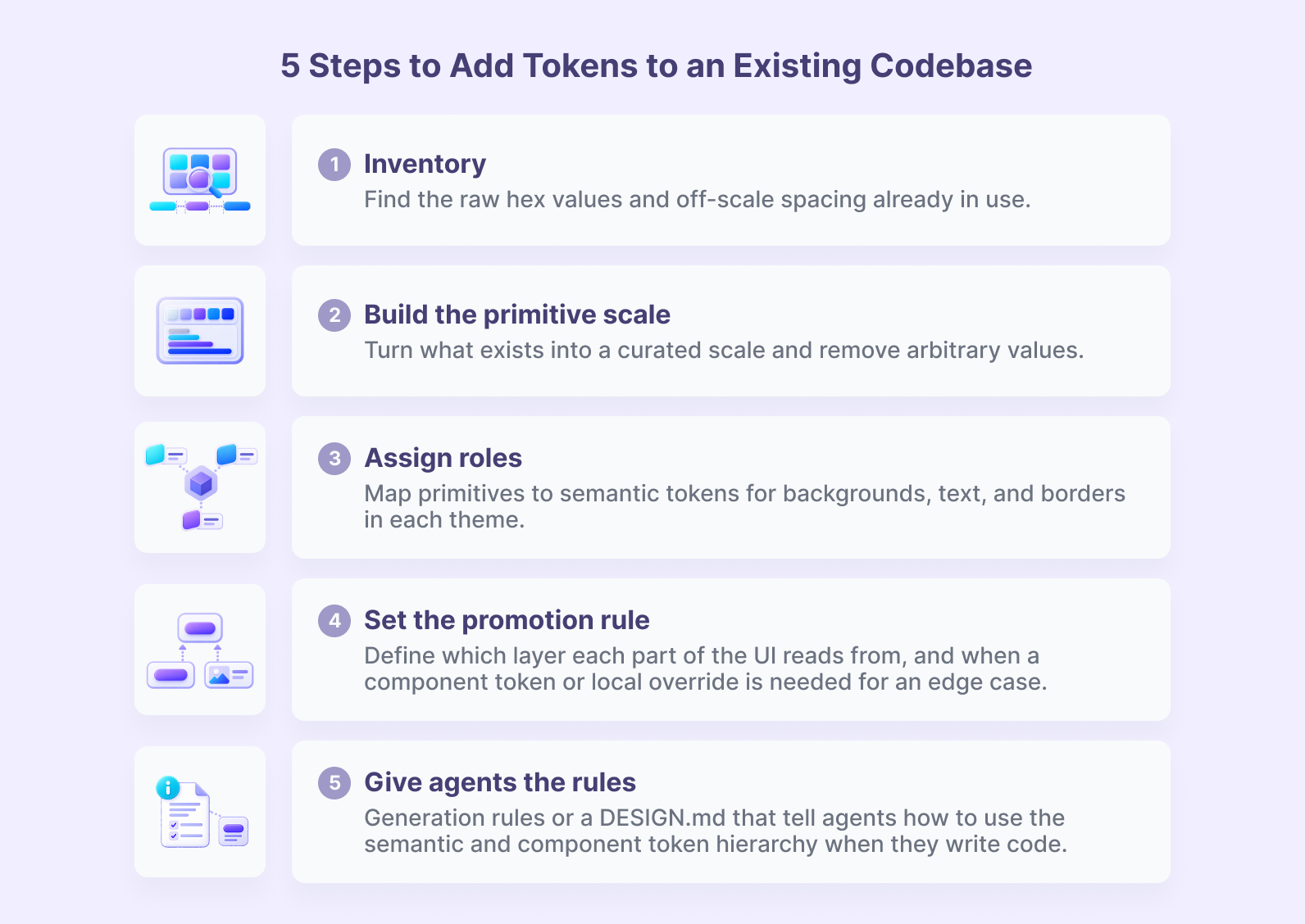
1. Start With an Inventory
List what already exists: raw hex values, off-scale spacing, and whatever variables the Figma file already has. The inventory usually shows more values in use than the design intends, and that gap is the case for tokens.
2. Build the Primitive Scale From What's There
Use what exists as the base. In the project mentioned earlier, the existing color scale became the base for mapping colors to backgrounds, text, and borders in light and dark mode.
Curate spacing into a scale and remove arbitrary values, so a global change reaches every component.
3. Define the Semantic Layer Before Converting Components
Set up the semantic tokens for each theme first. Converting components before the semantic layer exists means converting them twice.
4. Set Consumption Rules Early
Decide which layer each part of the UI reads from, and when a component token or local override is needed for an edge case. Without those rules, component tokens tend to multiply until they behave like a second global layer.
5. Expect the System to Change Along the Way
The token layer usually grows in steps. When the design arrives in parts, tokens get built incrementally alongside it.
Expect the taxonomy to change at least once.
Our own token restructure was scoped for three weeks and hit a blocker on architecture. A revised taxonomy from design, implemented by engineering, unblocked it, and the follow-on work was reconnecting components to the new tokens.
Design Tokens and AI Agents
Semantic names are context an agent can read. A hex value gives it nothing to work with.
What Happens When the Architecture Isn't Explicit
The first thing we saw was an agent using raw values from Figma instead of the defined tokens, because the architecture wasn't explicit enough for it to follow.
The fix was a component generation guide covering the right tokens, repo conventions, and reuse of existing atoms.
It became a sequential workflow: the agent takes a Figma URL, inspects the styles and proposes a structure with confirmation questions, validates the repo's conventions, and then generates the component and its story.
Context That Helps an Agent Use the System
A few pieces of context made the biggest difference:
- A component map. A JSON file in the repo links each Figma node to its React import, props, and a code snippet, and it loads as context at the start of every session. It works as a lightweight, repo-based option for AI workflows on teams without a Figma Enterprise setup. It maps components the way Code Connect does, with trade-offs: it uses session context tokens, needs manual maintenance, and doesn't create a direct bridge between Figma and the codebase.
- Per-component specs for large libraries. In a client library of 200 to 300 components, an agent couldn't tell when to use each one. A JSON spec per component fixed that by covering name, category, purpose, variants, when to use and when not to, accessibility, responsive behavior, and notes.
- Strict rules in the agent's instruction file. Without them, the agent skipped steps or built a canvas instead of a page.
What Testing Showed
In a button test, the agent reproduced the variants with correct names, semantic tokens, and no hardcoded values. A missing shadow exposed a Figma style that was never mapped as a variable, which is exactly the kind of gap that's easy to miss by eye.
Gaps in context get improvised. The agent used native HTML until a command enforced shadcn/ui primitives, and it drew its own icon until an icon skill was added.
Context also has a cost. Large context files get expensive as models change, and the direction we're seeing is lighter context with clear guardrails.
Agent output is a starting point. The team keeps ownership of the system and of QA.
How to Keep Design Tokens and Code in Sync
The main risk is drift: the same information lives in Figma, Markdown, and JSON, and the copies slowly fall out of step.
A few practices keep them aligned:
- Pick one source of truth. Decide which source leads and how the others follow it.
- Version the spec files. Each version references the Figma URL it was built from.
- Check specs against the tokens regularly. Our audit command checks component specs against the semantic tokens.
- Watch for unmapped variables. The missing shadow from the button test is the kind of early signal that design and code have drifted.
For the full review process, see our guide to design system audits for AI.
Where to Start: Get a Clear Picture of Your Token Layer
Start with the token layer, since everything an agent builds reads from it. Once primitives and semantic tokens are in place, components, specs, and agent workflows have something reliable to build on.
Our design system audit maps your token layer, naming, and how much of your live product actually uses the system, then sets the order of fixes. If your product grew faster than your design system, it's a practical place to begin.
Get in touch with our team so we can start right away.
Frequently Asked Questions
Design tokens are named values that store design decisions such as colors, spacing, and type sizes. Each token pairs a value with a purpose, so designers, developers, and tools reference the same decision across Figma, code, and other platforms.
About the author
Betsy Amparán, Product Designer
A versatile designer specializing in Product Design with a strong background in Visual Communication and Branding. My passion lies in crafting solutions that deeply resonate with people's needs and aspirations.
Related Content

Why Enterprise AI Needs a Design System Agents Can Read
By Betsy Amparán, October, 26, 2026